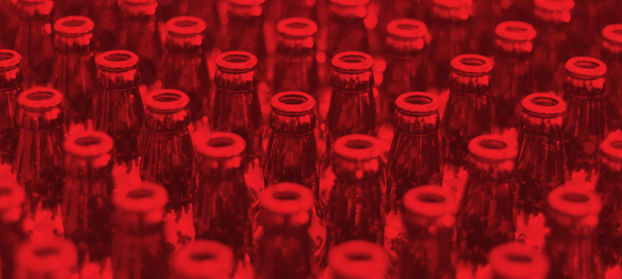
Whether you consciously appreciate the artwork or subconsciously peel away at the corners, beer labels are the outward-facing “face” of a beer and play a significant role in how we select our suds.
Unless you’re trained to notice design, you probably don’t realize the amount of work and research that goes into label design. The typography, illustrations, layout and palette are carefully calculated design choices that reflect not just the brand, but the beer style, brewery location, occasion and even time period.
Even for long-established brands like Anheuser-Busch, iconic and time-tested designs are prone to modernization every once in a while to revamp the brand and connect with the current generation of beer drinkers. A 2011 article in St. Louis Magazine explains that Budweiser’s last design update, a fairly significant change, was finally implemented after 18 months of testing.

Label Art: Worth Its Weight in Beer
There are many reasons breweries invest resources into their beer labels. The first is the ability to lure in new customers. An attractive design can have you reaching for a six-pack before you’ve learned if it’s an IPA or a Hefeweizen. Also, well-designed labels can strengthen the brand of the brewery, especially among those that have a variety of brew types under the umbrella of their brand. Labels should clearly distinguish the different brew styles or flavors without straying too far from the brewery’s overall branding and personality.
Finally, a beer label can help generate a self-sufficient brand for a specific brew. Think of New Belgium Brewery, whose Ranger, Fat Tire and Shift beers stand out as their own brands.
Designers on Design
To further delve into the art behind the labels, we turn to those who spend their days working with these designs, some of our own creatives, to chime in on the topic.
Andy Dyer, Design Manager + Print Buyer: I’m always interested to see what the micro and craft beer brands are doing. The bigger brands have their established looks. And like any good brand initiative for their consumer, they know what I’m expecting and I know what that brand looks like.
Conversely, what intrigues me with the craft surge is that you never know what you’re going to get. Each microbrew has its own personality, distinct look and attitude. It’s interesting to see how their local designers, artists or illustrators have rendered their unique look and feel on packaging to extend brand awareness. The different styles of brews and how they’re named gives the brand and packaging reason to work together. For instance, brands like Goose Island, New Belgium, Anchor Steam and Sierra Nevada have an immediate visual payoff with a goose icon, bicycle, boat anchor and mountain range, respectively. The more creative and obscure the name, the more clever and crazy the packaging design and label will be.
Having started in the creative business in the type industry, I will always be drawn to a package, bottle, design that has a great and strong use of type. With that being said, great creative is elusive and a well-designed and thought-out piece is a great and unexpected find.
Theresa Hines, Art Director: A less traditional beer label that I like is for Four Hands’ Smoked Pig. It is illustrated and also reproduced as printmaking posters. This brewery has a unique label for each of their releases, and the content is usually colorful and symbolic of the name and type of beer. The imagery is fun and reflects the flavor/ style of the beer. Overall, the label conveys that is has a smoked flavor and is probably a heavy beer. This label fits my own style because I have a strong interest in illustration and printmaking – this ties the two together!
I always buy beer based (at least initially) on the design. Since I am a designer, visual cues almost always affect my decisions. If I am not attracted to the label art, I could be attracted to the tap handle if I am buying a draft beer.
Designing Beyond Aesthetics
We came across an article the other day that featured a man named Kent Martin who works at the Tax and Trade Bureau (TTB) as the sole certifier of beer label designs in the United States. Every single label design comes to him for approval. Martin has allegedly yea-or-nay-ed nearly 30,000 label designs, infamously rejecting designs for what some would consider simple design elements – such as the heart on a deck of cards implying that the beer contained health benefits.
The fact that Kent Martin even has a job is proof that beer labels, more than the average package design, are profoundly influential. They can prepare your palate for bitter hops, invigorating citrus or mountain-fresh taste. They can coax you into spontaneously branching out from your standard selections or transport you back into nostalgic rituals. Like it (believe it) or not, labels are lures that intimately hook the consumer in us all..
Not every beer lives up to its label. And not every label matches the quality brew inside. But the elaborate branding that goes into most beer styles is unmatched in other industries – and that’s something we all can appreciate. So, the next time you find yourself aimlessly scratching your head in the beer aisle, overwhelmed by the thousands of options to choose, go with the art in your heart and pick the one that looks best. You may be surprised (one way or another).
Thirsty for more? Email Andy or Theresa at AndyD@TheSwitch.us or TheresaH@TheSwitch.us.


