


You are you for a reason. You have defined human features and distinct characteristics. There’s no one else that’s an exact match of you, and so should be the case with your brand. Your product may exist alongside other products with similarities, but that doesn’t mean your brand or product should be mistaken for another. The point of branding is differentiation. So, be bold. Be loud. Be you.
It can be hard to explain what makes your product better than others in your industry. Maybe you want to emphasize the history of your product in order to be seen as industry experts. Or perhaps you just don’t want to look and sound like other brands next to you on shelf.
Over the years, the Switch Digital and Brand Marketing Team has been tasked with these challenges from CPG brands that attend The Sweets & Snacks Expo. Below are a few of the ways we’ve met these challenges with creative and strategic solutions.
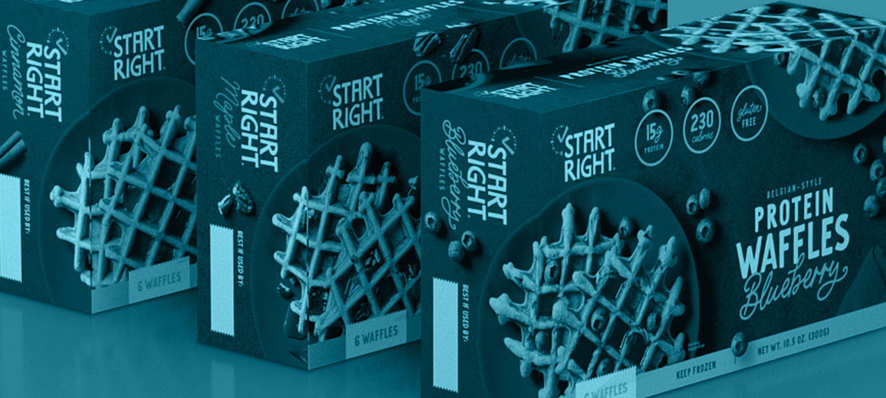
Helping a Small Frozen Breakfast Brand Break Through a Category of Sameness
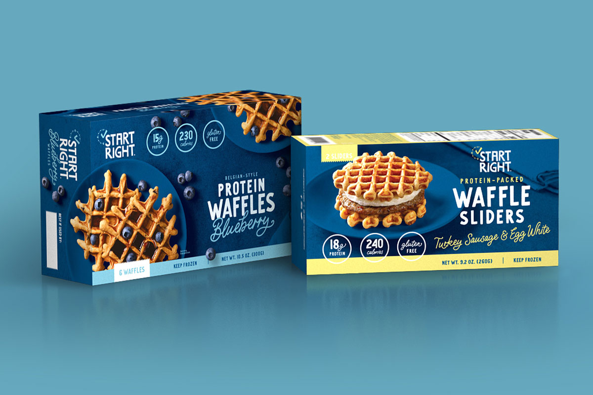
Start Right Foods make protein-packed waffles and waffle sliders as a healthy, on-the-go breakfast. They were happy with their current logo and overall positioning, but after performing some research and consumer audits, the insights led them to realize that refreshing the brand was necessary to grow their business. This refresh included making updates to product packaging, branding and messaging, marketing and promotional materials, along with their website.
When we conducted research of their industry, we quickly discovered that many products in the frozen breakfast section look and sound the same. From the use of the same warm color tones (yellow, orange, red) and clean, white backgrounds to the layout of food and type, the package designs had become overly expected. As a result, it’s hard to distinguish between brands in this section. This creates not only brand confusion for the consumer but fails to highlight the specific attributes and qualities that make each brand unique.
Our research then extended beyond the specific frozen breakfast section and into other brands that Start Right’s target audience would be interested in, including better-for-you, health food brands that specialized in high-protein, gluten-free, and low-calorie food products and snacks. When you have an industry that all looks and feels the same, how do consumers know to grab your brand over any others?
Designs that Feel Fresh, Stay True to the Brand, and Highlight Product Benefits
We needed to create a design for Start Right that was going to stand out in the cooler. As the first high-protein waffle slider to market, we needed to create a package that showed that Start Right is leading the way with a new product and not following down the same path that similar products have already established.
Key visual and narrative communication points for our designs:
- These are not your standard on-the-go breakfast products
- These are products you won’t feel guilty eating
- There are many health benefits
- Despite the health benefits, these products taste great
In order to stand out on the shelf, the packaging couldn’t lean on what has been overused and what Start Right had done before. We approached this by bringing in new colors, new style, and a new approach, but maintaining the same brand vision. The cooler blue tones helped the product stand out in the cooler. The new product photography expresses the artisan, handcrafted quality of the waffles. We then incorporated large health callouts and new copy that highlights the health benefits and speaks to the fitness-focused audience. All of these new elements combine to create a more elevated look and feel for the brand and allows the product to stand out and clearly communicate that these aren’t your standard frozen waffles.
Elevating an Iconic Brand by Going Back to Their Roots
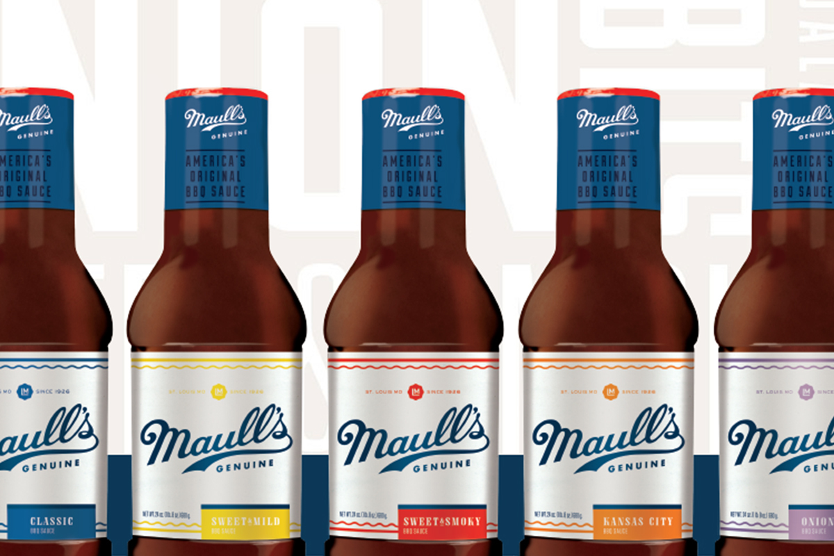
If you are from the Midwest, then you know that Maull’s is synonymous with BBQ. In 1897, Louis Maull opened the original Maull’s factory in downtown St. Louis on the riverbank. It was here where he went on to innovate the food industry with the creation of America’s Original BBQ Sauce.
The iconic St. Louis brand turned to Switch for a complete relaunch that officially kicked off in 2019. We began with a new package design that updated the original sauce and the different flavors that fall under the Genuine line. We incorporated a diagonal label that wrapped around the entire bottle to really highlight the famous signature logo while incorporating subtle design elements that hinted at the heritage of the brand, including a rippled outline to invoke the river of the original factory’s location and the LM stamp in honor of the founder.
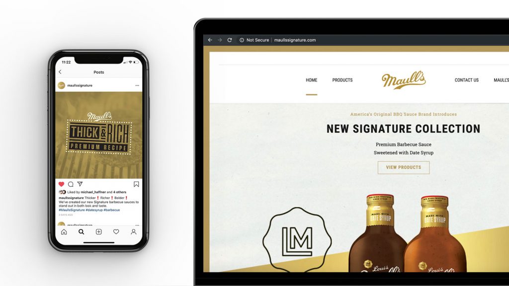
The next phase included redesigning their website to match the new branding and serve as an informative space to highlight the history and tradition of the brand. We incorporated custom drawings to serve as icons and a more streamlined layout that spoke to the big and bold flavor of the sauce. But most importantly, we wanted to create a user-friendly experience to bolster online sales. We supplemented all these elements with a new social campaign to unveil the return of America’s Original BBQ Sauce to store shelves across the Midwest.
Serving Up a New Collection from an American Classic
As we rolled out the new look for Maull’s Genuine, we were simultaneously building an entirely new brand under the Maull’s name. While Maull’s Signature may share the name of the founder of Maull’s Genuine, that’s where the similarities end. The look and feel of this new pair of sauces under the Signature label had to be entirely different. The quality and flavors are elevated, and in turn, the packaging and branding had to reflect that.
A new glass bottle was incorporated to represent this higher-end product. A prominent gold label was brought in on both the neck and bottle labels to speak to the premium quality. And from a communication standpoint, it was key to include what they included and not included in these sauces: these were made with date syrup, not high-fructose corn syrup. Like with the Genuine line, we supplemented the creation of this new brand with a website and social media campaign that incorporated elements like butcher paper and gold ribbon accents to help communicate the artisan quality. All these design and communication elements combined to show how this new line of sauces was unmatched on store shelves.
Ensure Your Brand is Not Bland
It’s not easy to stand out from the pack. You aren’t just competing with other brands in your industry, you’re competing for the attention of a consumer that is being pushed and pulled from brands across many industries. And at the end of the day, you want your brand to rise to the top of mind – especially since space in consumers’ brains is incredibly scarce.
While differentiation can be hard, it’s not impossible.
And that’s where we come in. Learn how your brand can stand out from the competition by contacting Chris Jobst.
314.206.7804 or ChrisJ@switch.us
)