


Continuing our Image Concept series, this post explores the difference between raster and vector. Have you ever wondered how some images can be beautifully scaled to enormous dimensions (like giant cereal boxes, for instance), while others appear blurry or blotchy when resized? This is a classic Raster vs. Vector situation. Put simply, raster graphics consist of pixels, whereas vector graphics are made up of points and lines. But let’s take it further and put the example of Old Glory back to work.
In the examples of the previous post, we discussed how the individuals wearing red, white or blue represent individual pixels that make up the image of an American flag. The more people packed into the space (or the more pixels per inch – PPI), the clearer the image.
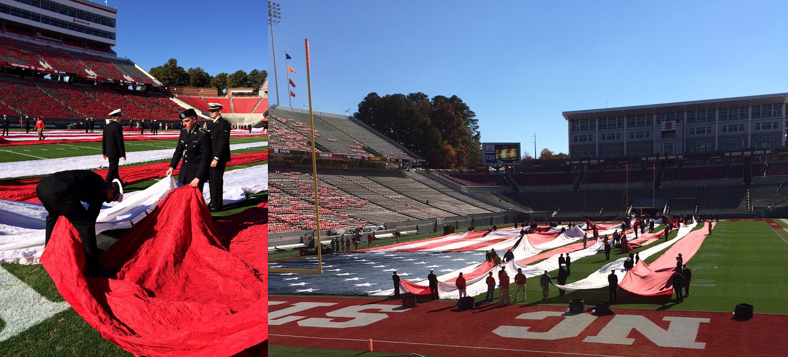
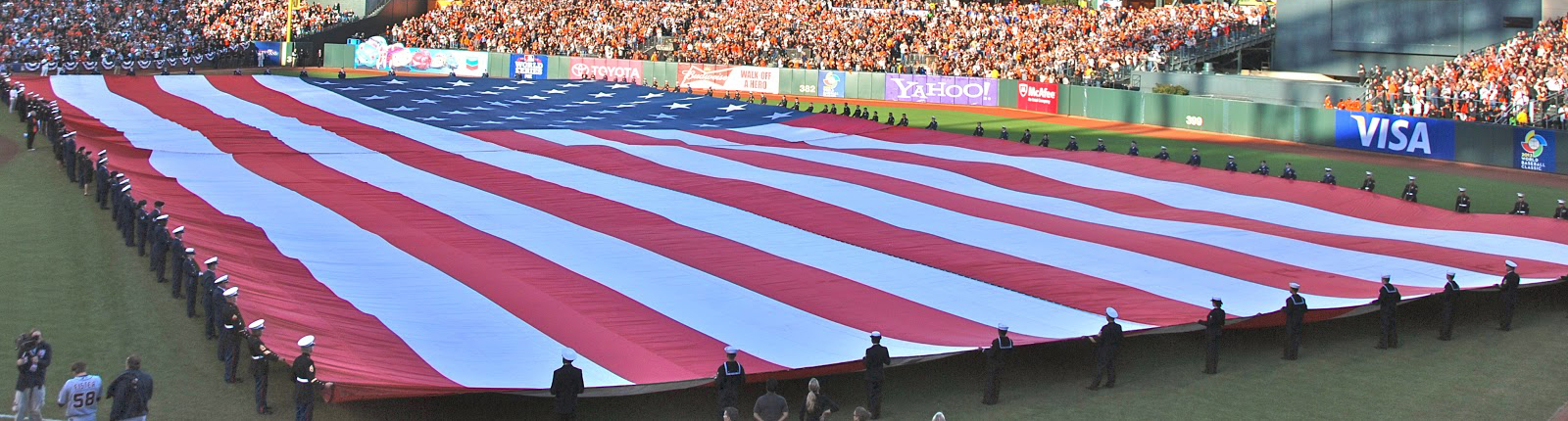
So imagine you needed to make a “living” flag the size of a football field, but you only have 150 people available. Impossible, you say? Scattered across an area that size, 150 participants will hardly make a dent.
But what if instead of the participants dressing in red, white or blue shirts, they can hold onto the edges of red, white and blue fabric?
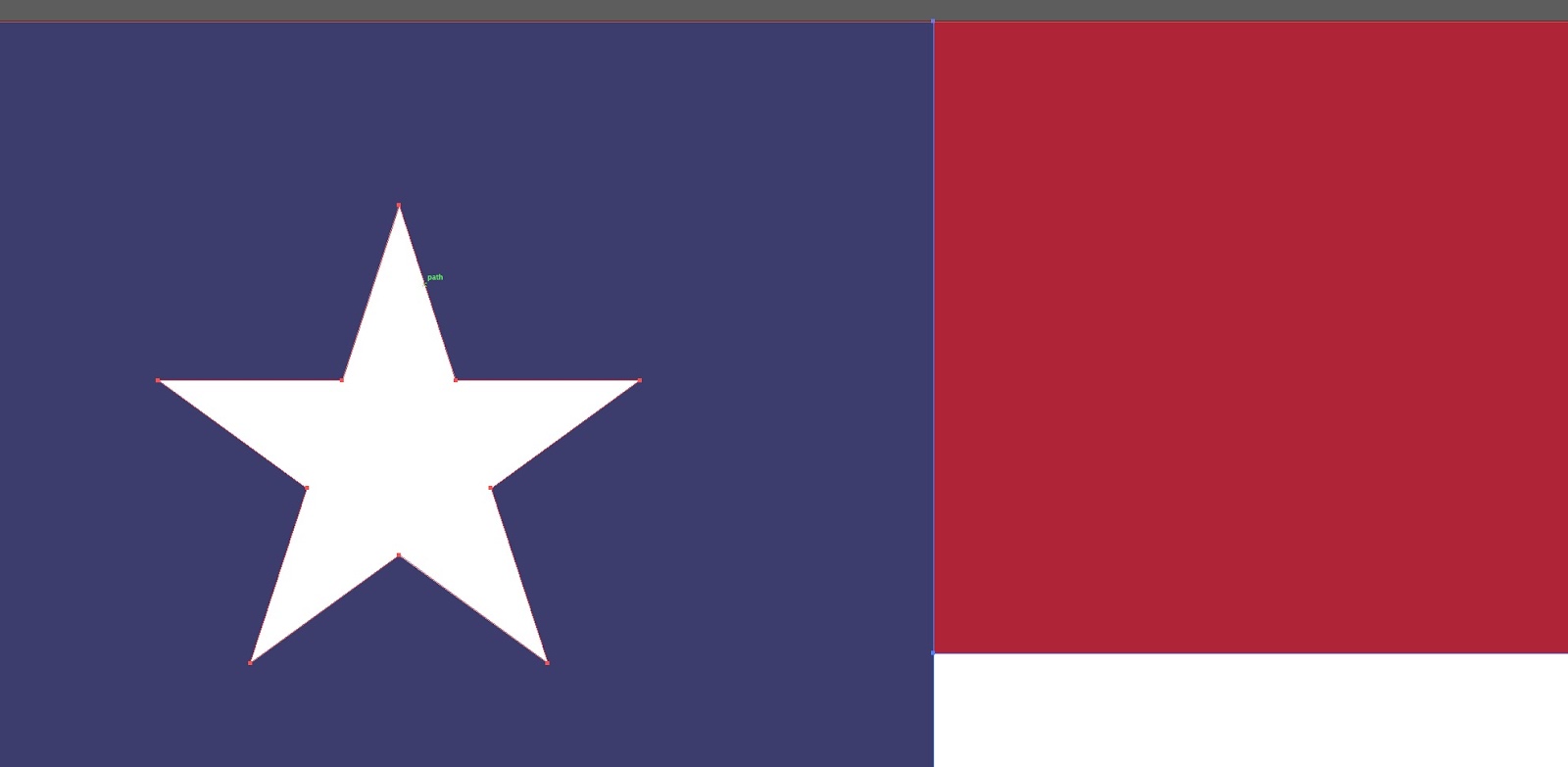
Amazing, right? The point is, with vector graphics, instead of filling an area with a finite number of pixels, all you need are anchor points and paths to create shapes that can be filled with color, like a few people holding big pieces of fabric. The photo below shows how the lines and points are filled in with pools of color – not pixels. (And no, that’s not the Texas flag – just an enlarged sample of a vector-based flag image.)
Why would you choose vector over raster? There are a couple benefits to using the vector format:
- Scalability – Because you’re not using pixels, you don’t have to worry about resolution. And since you don’t have to worry about resolution, you can scale the image up as big as you want (you know, in case you want to enlarge your cereal box artwork). The number of points and paths remain the same, and the lines and edges stay crisp and clean.
- File size – Because there aren’t millions of individual pixels, there’s not as much information to cram into the file, which keeps the file sizes down. Think about it as an expense: Imagine feeding all the troops holding that fabric flag, versus the 10,000 people in that living flag we looked at earlier. What’s the cost comparison going to be?
The obvious limitation is that vectors really only work for illustrations (i.e. Adobe Illustrator), not inherently pixel-based photographic imagery. But if you’re creating a logo, typography, or any sort of shape-based illustration, vectors are likely the way to go.
Once you understand the difference, it is pretty easy to tell whether an image is raster or vector – just look at the file extension. File formats like JPEGs, GIFs or PNGs are pixel-based rasters that are limited in scalability (at least if you want to maintain resolution). But EPS, SVG (XML-based) AI and sometimes PDF files are vector – also known as source files. They contain much more flexibility. Logos and other branding elements are typically designed as vectors so they can be recolored, resized and reformatted without losing quality.
Files created as vectors can be saved to a raster format (.jpg, .png, etc.), thereby losing flexibility. That can be confusing for novices. So when someone calls for the “native” or “source” file, they are referring to the original vector file (.ai, .eps, etc.)
If you’re not a graphic designer or printing pro who bleeds CMYK, you may not apply this lesson to your daily life…but in today’s digital-heavy world, it’s certainly worth knowing. Oh, and if you aren’t familiar with the significance of CMYK, stay tuned for Part 3 of this star-spangled series.
)